Which are the most important web design trends?
A question that occurs often in the domain of web design and development. Trends in design were and will always be important because design is the first thing a user gets in contact with. Before we go further, we must emphasize on the fact that web design means not only the graphic design and layout of elements on a page – it covers user interface and experience!
WE have done a research about the most important, major trends in web design. Here they are:
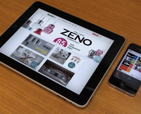
1. Responsive and mobile friendly design
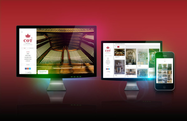
There are so many devices and resolutions that a responsive site a must. But we can’t say that this is something entirely new. What is new is the fact that even the mighty Google is ranking mobile friendly websites higher and the reason is very clear: more and more users are using mobile devices.
The ImOK team took part at a very interesting conference/workshop, Business Days Bucharest to be more precise, where a speaker said something that caught my attention. He said that in his opinion, there will be a time in the near future where web pages will be designed and developed primarily for mobile devices and not for PC’s, like it happens now. And I think he was right, because all is pointing in this direction. So when designing a webpage, this has to be simple, intuitive and similar to the design of native apps!
2. Performance and speed
Pages that load quickly are likely to be more productive. We said it on our webpage, when we introduced ourselves and I’ll repeat myself again: “Five seconds , or less – that’s how much you have to convince visitors to stay on your web page.” If a page loads more than a few seconds, chances are high that visitors will abandon your site. And who wants that?
Five seconds , or less – that’s how much you have to convince visitors to stay on your web page.
We are living in the age of information and people can get impatient if a site has performance issues.
3. Infinite scrolling
Yes, the time has finally come when humanity enjoys scrolling. It took a long time for everyone to get used to it and not be annoyed because of it and the general reasoning is that people are scrolling more and more on their smartphones, tablets, phablets. And because of this feature, pages will get taller and information will be more spread so no need to squeeze everything in the fold area.
4. Flat design + Material design
As I mentioned before, it is very important for a website to load quickly. But it’s not only about this technicality – a website should be easy to understand. Simplicity is a very precious asset nowadays in the design of a web page and is very much appreciated by any user of the Internet. Minimal designs, beautiful interfaces, ring a bell? If you use mobile applications, it should. And now these apps seem to redefine user expectations, influencing web design.
Flat design is a current and also a future trend. And the usage of icons relating to the copy of the site can be very engaging in our opinion. If you look at our latest designs we made, you will notice we like icons. Ghost buttons – another design buzzword developers should consider!
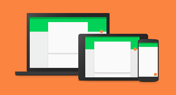
Material design on the other hand is the extension of flat design, but not only that. According to Google, material design is
a visual language for our users that synthesizes the classic principles of good design with the innovation and possibility of technology and science.
Quite a description, huh? The point of this material design is to create something for everything. Since there are so many platforms and screen sizes, Google wants to give the same experience, no matter what device we are using. Material design is Google’s guideline, principles developers should consider, adding animation, movement and lots of colors.
If you are interested in the details, you can find out more about Material design, here
5. Big images and the rise of animation
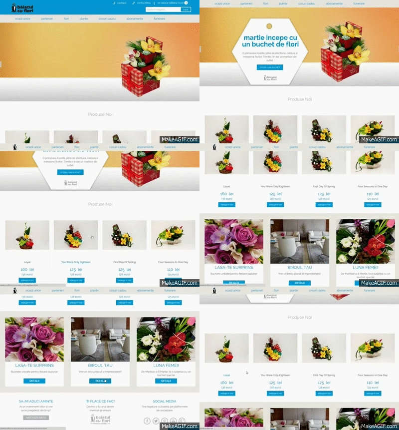
Scrolling through what? The answer: simplified content, with big images and animations which carry information. Less text, more visual representation. And when it comes to animation, GIF’s are the best choice – they load quickly because their size is small, so no more Flash animations, please! Embedding of video content is also an option.
As it is very important for a website to be responsive, images have to scale to different resolutions. High resolution pictures and vector images are the future. And another thing: if it’s possible, use customized images and not stock photos.
NOTE: This GIF was made only for an example. Content for a well designed website requires high quality images and animation, therefore more time and proper tools, definitely not using free online .gif creators. One of the reasons – they will have a watermark which is completely unprofessional.
6. Large typography
Images and animation will be completed by less text which are bigger, completing the structure of a page, giving more meaning. It’s rather a harmonious setup: flat, ultra-minimalist design with large and high resolution images, animation for a more engaging context completed with large fonts. And if responsive design is a must, maybe responsive typography should be too. Correction, typography HAS TO BE responsive, and that’s that 🙂
Conclusion
Keeping up with trends is obviously important. Either you go with the flow or you create something unique but also desirable, where users can be easily converted to potential customers. It’s easier to do the first thing, much harder to set up a trend.
Since there are so many platforms and devices we are using, it is very important to be able to provide the same experience. Apps and the heavy usage of mobile devices influences more than ever web design. What we have seen on mobile we will see more and more on desktop. Are you excited? I know I am 😀
What do you think, what other design trends did we miss? What would you add or what is that you do not fully agree with? Let’s discuss, leave a reply.

Leave a Reply
Want to join the discussion?Feel free to contribute!